- Elements
- Buttons
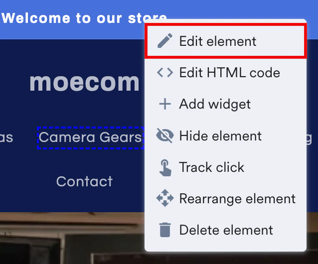
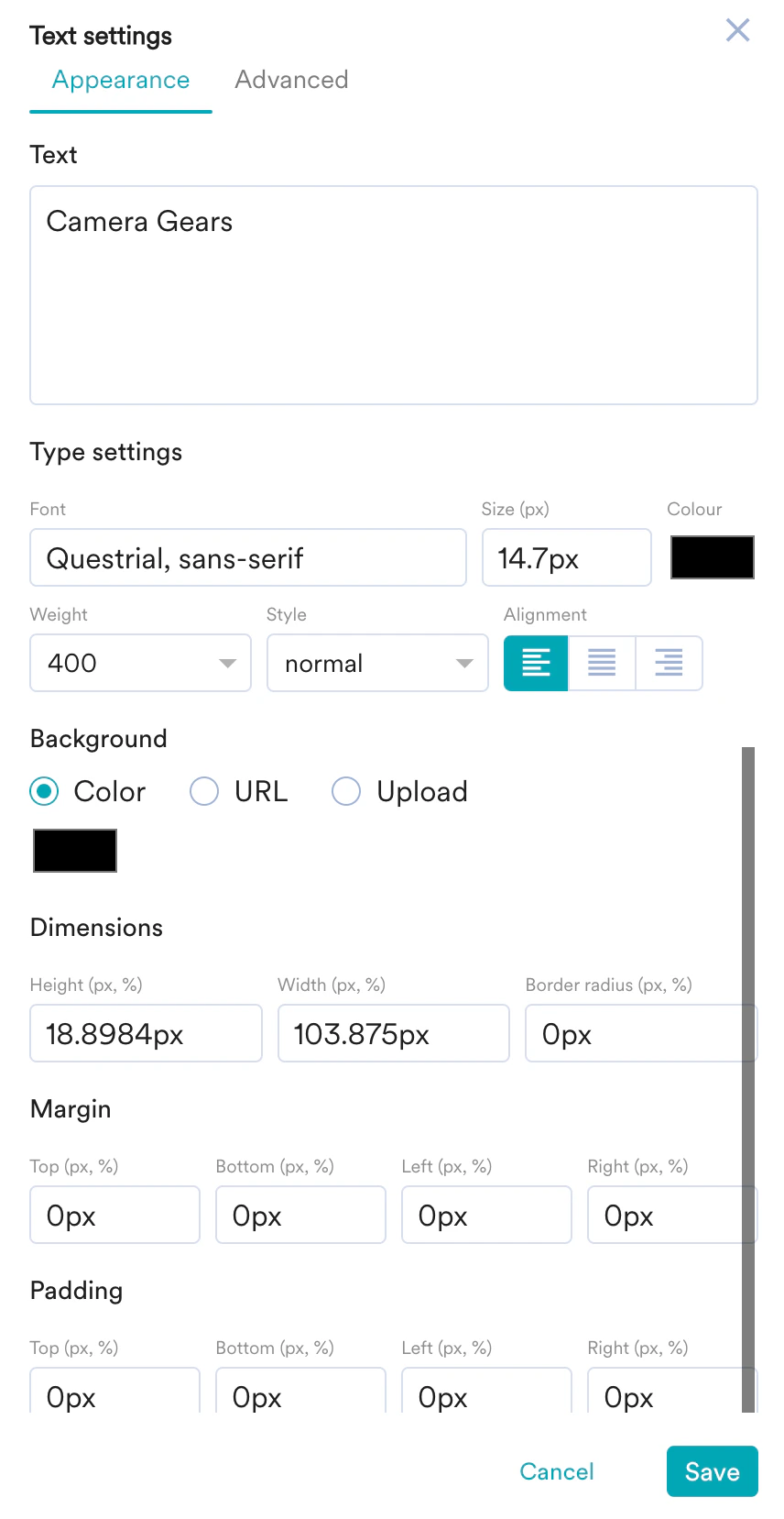
You can edit the selected element in the following two sections:
- Appearance
- Text: Add relevant text on the selected element.
- Type Settings: Customize the Font style, size, color, weight, and alignment of the text.
- Background: You can make the following edits to the background of the selected element:
- Change the background color.
- Embed an image URL.
- Upload a background image from your local storage.
- Dimensions: Set the Height, Width, and Border radius of the selected element in pixels or percentages.
- Margin: Set the Top, Bottom, Left, and Right margins for the selected element in pixels or percentages.
- Padding: Set the Top, Bottom, Left, and Right padding to generate space around the text inside the borders of the selected element.
- Advanced
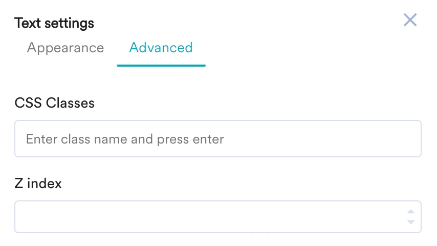
You can also use custom scripts to edit the selected element. - CSS Classes: Enter the class name to apply the custom styles to the selected element.
- Z index: Enter the Z index value to change how the selected element is displayed when it overlaps with other elements.
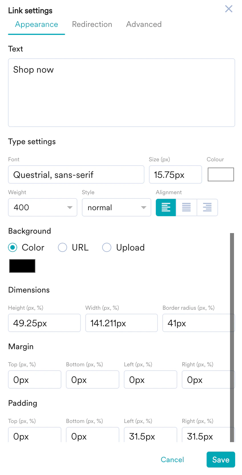
You can edit the selected button in the following three sections:
- Appearance
- Text: Add a relevant button label.
- Type Settings: Customize the Font style, size, color, weight, and alignment of the button label.
- Background: You can make the following edits to the button background:
- Change the background color.
- Embed a URL to the button label that redirects the user to the relevant webpage.
- Upload a background button image from your local storage.
- Dimensions: Set the Height, Width, and Border radius of the button in pixels or percentages.
- Margin: Set the Top, Bottom, Left, and Right margins for the button in pixels or percentages.
- Padding: Set the Top, Bottom, Left, and Right padding to generate space around the label, and inside the borders of the button.

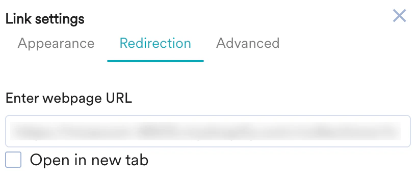
- Redirection
- Enter webpage URL: Enter a URL that redirects the users to the relevant page when they click the button.

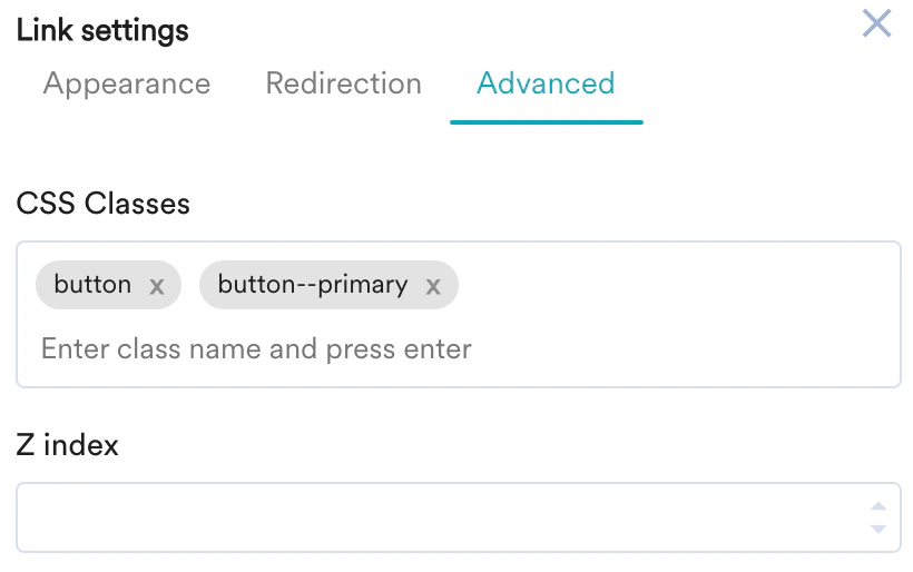
- Advanced
You can also use custom scripts to edit the selected button. - CSS Classes: Enter the class name to apply custom styles to the button.
- Z index: Enter the Z index value to change how the selected button is displayed when it overlaps with other elements.